Sunday, December 19, 2021

Final product linked page

  WEBSITE final product

This is the link to my website https://rharrasy.wixsite.com/website


The linked page is the Sports and Wellbeing heading


The Sport and Wellbeing page highlights Mark's story regarding his backstory and where he got to in life currently. The audience hopefully relate or aspire to be like Mark pertaining to the hard work and dedication to takes on to achieve his goals. The audience can use the #Newawakening to share similar stories.


I have included top inspirational quotes for the audience to interact with inspiring stories like this . They can use the hashtag to be included next time on the website

Also I have included Q and As online , where the audience can tweet any question they like to Mark and he can answer .

Final product website homepage

website final product

This is the link to my website https://rharrasy.wixsite.com/website


When the website is first opened by the reader , a pop-up automatically appears , asking the reader to subscribe to the magazine and offers exclusive information


This free gift is only enabled if the reader clicks on the 'New Awakening' logo. The hidden Easter egg is used to engage and interact the readers , whilst giving them new and exciting free gifts on the website.


The homepage of the website incorporates the colour palette of yellow and red to match the brand identity. The colours are eye catching and engages the audience.
The homepage contains all the magazines social media sites which relates to cross media convergence  , an option to email us , which takes you straight to your email , a log in bar to effectively allow readers to log in and our of their account and also a language translation tool , which helps readers who speak more than one language.

On this website I have used hashtags and different social media elements to engage the 16-25 year old demographic , as the new and developing use of the internet and technology appeals to them.
The navigation bar allows users to explore the contents of the website much easier , then just scrolling through everything. 


I have included the 'Anchor Menu' throughout the website , so audiences can specifically choose the content they would like to see rather than read through all sections . I believe this is important as this allows users to easily navigate themselves to specific content. This therefore increases the feature of interactivity and a total individualistic element of control for users.


The readers are give the chance to read both issues and content pages , which hopefully makes them feel like they want to buy the full issue.  
I have also included a top news section where readers can click on them to take them to the chosen article on another page.


Here I have included a photo slideshow of three images . One of them advertises the radio show 'Awakening Connection' exclusive to the website. Another image advices the audience tor was the real life stories and the last image highlights how the first issue advices audiences to change their body for the better  . I believe this method is a more interactive way to allow the audience to access the information. 


I have included elements of the first issue , so audiences have an insight into what they are purchasing. Key features of the real life stories , Diet tips , Workout Tips and information on Personal Trainers for any advice.  


Throughout the homepage I have included key aspects of the content audience would aspect from the magazine. For example Mental Health Week content for the Mental Health feature of the website. I believe this is an important way in providing information to the audience. 

As both issues focus on key individuals , I believed that it would be important to include both their stories, which are easily accessible to the audience. By clicking on read more , it takes them to their stories on the linked working pages.


By buying the issue and reading our contents page , the audience can have two chances to win prizes from us on the website. This feature increases audience participation and encourages interaction. Both the prizes are linked to the purpose of the issue . For example the sports edition has a prize of a free workout and diet plan.


The video on the homepage is mainly a summary of the advert both magazines bring . The audience can interact and enjoy the video , rather than just read through all the information.


Both the FAQs and the Tweets increases interaction with the audience , especially by using hashtags the audience become active instead of passive. 


Sunday, December 12, 2021

Product issue 2 update


Front cover


Here I have included all the content of my product but through consideration I have decided to change the layout and main image of my product . I believe the main image should be brighter to correspond with the purpose and real life stories it contains. The masthead is larger and the logo has reduced in size. The colour palette of orange and yellow is clear throughout the cover lines , puff and masthead to reflect my brand identity. 

Contents pages


I decided to change the layout of the entire contents page to due to irregular spaces and font sizes , but I have kept the content the same . Here I have also followed the same colour palette of mainly orange to reflect positivity and my including multiple images of positive images together with the sunset Background , I believe I have succeeded in this . I have also included a call to action where the audience can view the online advert in the website 

Product issue 1 update

front cover


I have decided to keep the main images of the front cover as I believe they carry very powerful connotations . I have decide to change the slogan ' Are you healthy and happy?' to 'Health and Happiness'. I have rearranged the cover lines and have changed the fonts and sizes. I have increased the masthead and reduced the logo . In addition to this I have rearranged the barcode , date , issue number and price tag.

Contents Page


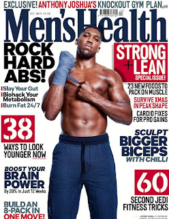
On the contents page I change the whole layout , this was also due to spacing and font problems . I have enlarged the images and have spaced the smaller images of the main background of the dumbbells in a very similar way to the Men's Health contents page. I have included more real life stories and have also included the slogan 'Health and Happiness', so it links with the Magazine and the audience understanding the purpose of the issue.


Wednesday, December 8, 2021

2nd front cover/contents pages development update


I have decided to remove the grey frame at the top of the magazine cover to create more space , which ultimately reduces the cluster of writing on the image. I have also rearranged the structure of the magazine  main image as I believe it is important to include the books and paper on the desk as it symbolises the main real life story. I have also changed the cover lines to relate to other real life stories and included a call to action for the magazine

I have included the Bauer Logo on the contents page have included more real life Stories on the contents page to reflect the overall brief. Also I have included number on the pictures to direct viewers to the content included. 


Wednesday, December 1, 2021

1st front cover / contents page development update

I have decided to remove the background for the final product as I believe the gym Background with the dumbbells resulted in the cover being too busy and cramped. Therefore the black Background with the red smoke highlights mystery and power , which ultimately reflects the main real life story in the issue. In addition to this I have enlarged the models and minimised the 'New Awakening' logo and moved it to the left. The cover lines had to be changed to reflect the brief , so I included multiple other real life stories , so my real life story magazine does not look like a sports magazine.

Pertaining to the contents page I have edited the editor's note and changed the information included in this month's issue to other multiple real life stories to reflect the media brief   


Monday, November 22, 2021

2nd front cover/contents pages development update


For the 2nd magazine front cover I have decided to use the colour palette of white , red and yellow to reflect the logo and overall brand identity. I have included a puff which draws the audiences attention to the real life story in this month's issue about Mental Health. I have included suitable cover lines that best reflect the issue. The next step is to include a call to action for the website and also I may consider minimising the logo as it is difficult to see the work on the desk. So I have to rearrange the structure.

I have included social medias which reflect cross media convergence on the contents pageant have used many call to actions. I may have to rearrange some stories which relate to general real life stories and to try and move away from just being based around mental Health. This contents page needs to include the Bauer Logo like the other contents page as well. 


Monday, November 15, 2021

1st front cover / contents page development update


I have chosen another original gym Background for the 1st front cover , with the real life story related to sports with other sports related content around the main models . I believed having dumbbells in the Background would be very symbolic of the purpose of the magazine. I have applied the colour palette of red and yellow to create a sense of brand identity on the cover lines. I have taken inspiration from the Men's Health magazine regarding the structure of the cover lines and main images. I have included a call to action , which directs users to the website , this reflects cross media convergence.

The contents page of the magazine includes multiple call to actions which direct users to the website and I have included the description of the main story and other information regarding the topic of the issue which is exercise and wellbeing. The editor's note highlights what the main magazine is about. I have experimented with using columns for the information included in the issue


Monday, November 1, 2021

Working video development and final design

Final working video


My final working video for the website was edited on 'iMovie', where I have included lots of videos I shot during the three photoshoots. I have made a story like production video where the audience can see and understand the true meaning behind the magazine 'New Awakening'. The first half of the video is black and white with low-key lighting with the student model in a room studying. This highlights the stress going on in students lives , together with the thunder and rain effect , which symbolises Pathetic Fallacy.
The audio then switches to more anticipation and suspense as the video and story develops.  The sunset is displayed to illustrate a new awakening to life. As the video continues I use more shots that I used during the photoshoot outside along the beach and in the gym of different models. This is when I decided to speed up the audio , using energetic fast paced music. I use first person camera shots , drone camera shots , high angle and low angle shots together with slow motion and fast motion shots to increase the professionalism of the video as a whole. I used the slogan 'Are you Healthy and Happy?' and the logo in the video to create and establish brand identity , whilst taking under consideration transitions and tempo of the video and audio. At the end of the video I included a call to action , by advertising the website www.newawakening.co.uk.


Monday, October 18, 2021

2nd front cover/contents pages development


I have started designing the front cover of my second magazine cover and I began to wonder if I should add the red fog effect to the cover. I think it's the right steps moving forward as I believe the red fog could be a reflection of the stress surrounding the model's busy life as a student.
I have begun adding cover lines to the front cover using bright saturated colours very much like many real life magazine such as 'Cosmopolitan'. In addition to this I have included a puff to promote the interview with the school student towards the readers. 
In the next few weeks I aim to complete this front cover cover lines , font and overall structure and move on to the contents page


Monday, October 4, 2021

1st front cover / contents page development


I have tested using different fonts and colours of the cover lines to correspond with my logo on the magazine cover . As it is a sports issue , I had to add the cover line 'Feel energised' to have a sporty feel to the magazine.
Currently I am woking with the structure and positioning of the models as well as the positioning of the cover lines , as my magazine hopefully would implement the structure very similar to a  'Men's Health' Magazine. 
Also I am currently deciding whether or not to add the red smoke effect. I believe it would be a great addition to both magazines as it illustrates the models emerging from their 'New Awakening' to then use exercise as a stress relief.


Monday, September 27, 2021

Development of the slogan


Final Slogan


I decided to have a question as my slogan on both magazine covers . The question 'Are you Healthy and Happy?' , covers both my Mental Health ideas and my Sports and wellbeing ideas. The reference to 'healthy' relates to exercise and diet and the reference to the word 'Happy' relates to your overall positive mental Health.
I believe it was vital that I combined both the key important aspects in my magazine.
My top two choices were 'Are you Healthy and Happy?' and 'MIND your Health' , but I believed asking a question to my audience would be the best idea in the long run.


Other initial ideas

Originally I wanted my slogan to either be related to mental health or sports and wellbeing , so I considered these slogans for my magazine front covers.

Mental Health ideas

Daily stress can leave your health a mess
Mental illness is not equal to failure
Mental illness is not a choice, but recovery is.

Sports and wellbeing ideas

Our warm up is your work out.
Health is the root of happiness
Stay fit, feel fit


Thursday, September 16, 2021

Final logo title and design / development ideas


Final logo design 

My final design is very different to my initial idea. I have chosen to have the colour palette of yellow which symbolises optimism , positivity and happiness  , but also the colour palette of red which highlights health , energy and excitement. So the colour scheme really corresponds with the different magazine covers and true meaning behind them.The design of the logo is very similar to a sunset , as I used the gradient colours to signify a new day and new beginning, hence the title 'New Awakening' 


 My initial idea was to have the 'New Awakening' title in a gold font in the middle of a sophisticated black background. With a symbol of a heart rate monitor in a persons head , this represents both the physical and mental purpose of my overall magazine. 

Thursday, September 2, 2021

Title ideas

 The original title idea 

Chosen title idea - New Awakening

I decided to name the magazine 'New Awakening' as I believe this name best reflects the overall idea of a new beginning to life , through physical and psychological wellbeing

My original title ideas  - Mind Utopia , Good vibes 

My aim was to not relate the name of the magazine with sports or mental health , but instead focus more on the individual as a whole.


Tuesday, August 17, 2021

Inspiration from photoshoots


Inspiration
I have taken inspiration from a lot of Fitness magazines like 'Men's Health' and 'Muscle fitness' as the models are always at centre of the shot , highlighting the action and sport taking place


Link to the website

Website link   https://rharrasy.wixsite.com/website